
How do you convince visitors your website is worth their time? There are so many elements that a top-notch landing page needs, and making those elements the “best” they can be often depends on what your landing page goals are.
If you’re looking to up your landing page game, it’s helpful to know what goes into a great one. We’ve compiled a list of landing pages we love so you can see these impressive designs in action and implement their tactics into your own landing pages.
Sign-Up Landing Pages
1. Shopify
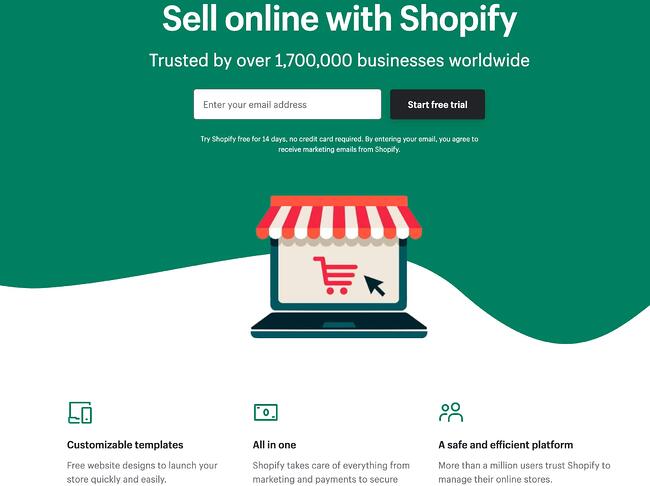
Like many of the other landing pages in this post, Shopify’s trial landing page for sellers keeps it simple. It’s not too text-heavy, but still manages to persuade users by noting a few key points about its top-notch product. Visitors come away knowing that Shopify is an all-in-one platform that is easy to use and trusted by many.
Why This Landing Page Works:
- Clean Interface: The user-oriented headline is just a few words, for example, and the page relies on simple graphics and short paragraphs to communicate the trial’s details and benefits.
- Concise CTA: There are only a few fields you need to fill out before you get started. All of this makes it easier for you to quickly get started selling online with their tool.
What Could Be Improved:
- Emphasize Security: The last column states that the platform is safe, but doesn’t explain why. Instead, it mentions that over a million businesses use it. A few words that speak to site security would improve this section since the number of vendors is already stated at the top of the page. Additionally, it would eliminate friction for visitors with security concerns.
2. Great Jones

Many of us have been doing a lot more cooking during the pandemic and looking to upgrade our gear. Great Jones offers up a landing page that’s as beautiful as its Dutch Ovens. It’s very aspirational and taps into all of our ideal kitchen dreams.
Why This Landing Page Works:
- Use of Color: Great Jones’ site is colorful just like its cookware. The use of bold colors quickly draws visitors in and makes the cookware stand out.
- Prominent CTA: You can’t miss this giant yellow CTA and bold font $100 Off coupon. Who wouldn’t want $100 off these gorgeous pots?
What Could Be Improved:
- Rollover Descriptions: With so many pans and utensils pictured at once, it would be great if users had the ability to view the name of the item. That way they could find it easier on the site when they’re ready to buy.
3. Muzzle

Muzzle, a Mac app that silences on-screen notifications, fully embraces this show don’t tell mentality on their otherwise minimal landing page. Landing pages help users decide whether or not your product or service is actually worth their precious time and energy. What better way to clearly and straightforwardly communicate your value proposition than by confronting visitors with the very problem your app solves?
Why This Landing Page Works:
- Show Rather Than Tell: Visitors to the page are greeted with a rapid-fire onslaught of embarrassing notifications in the upper left of the screen. Not only is the animation hilarious, it also manages to compellingly convey the app’s usefulness without lengthy descriptions.
- Cohesive Visual Experience: Even the text on the page is a muted gray color, mirroring the function of the product.
What Could Be Improved:
- Could Be Difficult to Read: While the light gray text on white background is great at mimicking the product’s function, it may be harder to read for some.
4. DoorDash

Takeout enthusiasts are no doubt familiar with DoorDash, the app that lets you order food from a variety of restaurants from your phone. Well, instead of customers, this landing page is geared towards recruiting Dashers who make the deliveries.
Why This Landing Page Works:
- Emphasizes Dasher Autonomy: This landing page really plays up that Dashers are independent and free to work when they want.
- Highlights Potential Earnings: While there’s no way to prove these earnings are typical, they are certainly enticing for anyone who wants to make extra cash on the side.
What Could Be Improved:
- Advantage Over Competitors: DoorDash is not the only delivery game in town. They could highlight what sets them apart from a competitor like UberEats.
5. Wise

Wise allows you to send or receive money in different currencies and countries, and its landing page separates customers into two categories of either Business or Personal so you’re not distracted by options that don’t apply to you. There’s even a short video to show visitors how the service works before they try it. Since they’re dealing with money, it’s important to get the customer experience right the first time.
Why This Landing Page Works:
- Highlights Safety: The security information is out front and center on this page, helping to ease any hesitancy a potential customer might have and assures them that Wise is a safe service to use to send money and receive .
- Emphasizes Value: In several places on the page, in both text and video, Wise reiterates that it’s less expensive than transferring money through a traditional bank.
What Could Be Improved:
- Interface is a Little Busy: While it’s great that customers have access to a wealth of information about the service, there’s a lot going on. There’s video, menus that appear when you scroll and multiple buttons — all within the top half of the page.
6. Airbnb
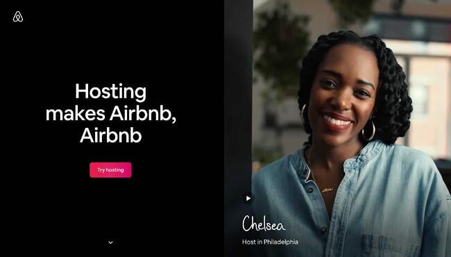 To help convert visitors into hosts, Airbnb offers some enticing personalization: an estimated weekly average earnings projection based on your location and home size. You can enter additional information about your potential accommodations into the fields to get an even more customized estimation.
 If you visit the page already convinced, the clear call-to-action at the top of the page makes it easy to convert on the spot.
Why This Landing Page Works:
- Personalization: Airbnb shows you right at the start what you could potentially earn based on your area and the size of your home. This is useful for potential new hosts who may still be figuring out how much they should charge and what they can expect to earn.
- Leverages Community: Further down on the page, those curious about hosting have the option to contact a seasoned Superhost to answer any questions they may have.
What Could Be Improved:
- Nothing: The page is clear, concise, reassures potential hosts Airbnb is safe to use, and offers a personalized experience.
7. Wag!

Wag! is a service that connects dog owners with dog walkers and sitters. This page gets right to the point with a large font encouraging prospects to join, and puts the sign-up form prominently on the right half of the page. The green background color makes the white font and other elements on the page pop. The addition of a QR code on the form is also a nice touch, enabling visitors to scan it, quickly download the app, and sign-up.
Why This Landing Page Works:
- Efficient Form: Leaving the form field open on the page means visitors don’t even have to click on a CTA to access it. The QR code further expedites the process.
- Emphasizes Credibility: Including caretaker photos and that more than 351,000 caretakers currently use the service nationwide makes Wag more trustworthy.
What Could Be Improved:
- It’s Not Compelling: Unlike DoorDash mentioned earlier, Wag! makes no mention of why people should join. What are the perks? Are the hours flexible?
8. Wistia

Right off the bat, you notice the blue background with the pop of pink in the form of a “Try for free” button. The page gets right into the action with a video showcasing all the cool content you can create. If you’re having doubts, you can always scroll below to read testimonials from some of Wistia’s 375,000 happy customers.
Why This Landing Page Works:
- Ease of Use: The form itself allows users to quickly fill it out by linking to their Google account. Doing so enables the autofill feature, which cuts down on friction for the user.
- Capitalizes on Visuals: As a video host, Wista does a great job of showcasing its capabilities using a variety of mediums. There’s colorful graphics, videos and even a link to marketing focused cartoons.
What Could Be Improved:
- Include an FAQ: Testimonials are great, but sometimes customers have a few concerns that could be answered quickly with an FAQ section. That way they can decide whether or not to sign up without having to leave the page to search for answers.
9. Webflow
 Webflow, a design tool for web developers, packs a lot of information into just one GIF. As with Muzzle, Webflow also gets right to the point and demonstrates what their tool can do, rather than just talking about it. The animated GIF is visible in the same frame on the website, so users can see how the product works and sign up without scrolling.
Why This Landing Page Works:
- Show Rather Than Tell: Being able to view Webflow’s tool in action gives potential customers a clear idea of not only what it does, but how their user experience will be.
- Removes Risk: In several places on the landing page, visitors are reminded that the service is free. There’s no trial to sign up for. They can build their site for free and decide whether or not to sign up for a plan when they’re ready to launch.
What Could Be Improved:
- Nothing: This landing page is the perfect balance of information, usability, and visuals.
10. Talkspace

Talkspace, an online therapy service, really focuses on trustworthiness with this landing page. All of the information on this page emphasizes that customers will have access to licensed therapists, and drives home that the service is secure and confidential. It’s a great way to reassure those who may be hesitant to participate. The use of shapes is also a clever idea. Pages are often filled with squares and boxes, so putting the CTA inside a large circle immediately draws the viewer in. Overall, the layout is clean, inviting, and informative.
Why This Landing Page Works:
- Builds Trust: The focus on customer security works in their favor, especially noting that they are HIPPA compliant.
- Provides Value: In addition to providing details about how Talkspace works, this page also provides several mental health resources and articles.
What Could Be Improved:
Nothing: This page has a great user interface and serves as a great starting point for mental health resources.
Ebook Landing Pages
11. Nauto

Nauto, a data platform for self-driving cars, helps make autonomous driving safer for companies who manage fleets of self-driving vehicles. Naturally, its customers would need all kinds of information to sell them on this platform. Nauto has it, packaged into a super-simple ebook whose landing page gives you both a brief contact form and some preview statistics to prove why this resource is so important.
At the top of the page, shown above, a warm photo of a car’s exterior r hugs the lead-capture form. The green “Download Now” button might’ve even been on purpose (on the road, green means go, after all).
Scroll down, and you’ll see another “Get the eBook” CTA to remind users what’s waiting for them. You’ll also see three jarring statistics about car accidents to entice users to learn more. Check it out below.

Why This Landing Page Works:
- Simplicity: There’s no distractions on this landing page, which is perfect given the company’s focus on safe, self-driving vehicles.
- Great Use of Comparison: Further down the page, Nauto offers up side by side footage of a distracted driver vs. a self-driving vehicle. It’s an excellent way to drive the point home that A.I. is a safer bet.
What Could Be Improved:
- Graphics: The warm photo at the top is really difficult to see. Slightly more definition would have helped visitors easily recognize the image as cars.
12. Industrial Strength Marketing

Right off the bat, this landing page pulls me in with a compelling, punchy header: “Don’t Make Me Zoom.” It directly speaks to a common experience most of us have had when we’re browsing on our phones or tablets — and it’s a little sassy, too.
But that’s not the only thing keeping me interested in this landing page. Notice how the color red is strategically placed: It’s right at the top and bottom of the form, drawing you even closer to the conversion event.


Plus, this design is meta to boot: It looks and works great on mobile, too (pictured above) Keep in mind that a lot of visitors will be accessing your landing pages on their smartphones or tablets, and if the design of your website doesn’t work well for them, they might give up and leave your page.
The folks at Industrial Strength Marketing made the fonts and form field big enough so that visitors don’t have to pinch-to-zoom to read and interact with the content, for example.
Why This Landing Page Works:
- Voice: The language is punchy and relatable, quickly drawing the reader in.
- Minimalist: The black and white color scheme with just a few pops of red really make the sign up sheet stand out. Additionally the minimalist design works beautifully on mobile and desktop, no pinching required.
What Could Be Improved:
Nothing: Both the mobile and desktop versions illustrate the perfect execution of a minimalist layout which helps the reader navigate the site with ease.
13. Inbound Emotion

Even if you don’t speak Spanish, you can still appreciate the conversion capabilities of this HubSpot partner site. My favorite feature of the page? The form stays in a fixed, prominent position as you scroll through the site. I also love the simple layout and warm colors.
Why This Landing Page Works:
- Fixed Form: Having access to the form while scrolling provides a better user experience. No need to scroll back up to the top of the page to find it.
- Simple Interface: The layout is simple, but effective. The use of only two shades of orange give a monochrome feel and keeps the focus on the benefits of the ebook.
What Could Be Improved:
- Make the Form Brief: There were six items to fill out, not including the check boxes option at the end. Longer forms could be a turnoff for some visitors.
14. IMPACT Branding & Design

Full disclosure: IMPACT is a HubSpot partner — but that’s not why they’re included here. IMPACT’s landing pages have long been a source of design inspiration. I love the simple layout of the page, from the large headline copy and detailed featured image, to the outline that surrounds the form, to the colors and fonts that are very pleasing to the eye.
The free guide IMPACT is offering for download here also doesn’t emphasize the download itself in the blue button that allows you to submit your filled-out form. Rather, IMPACT is inviting you to “generate more conversions” — putting the focus on what you stand to gain as a result of reading the guide.
Why This Landing Page Works:
- Clever Messaging: You’re not downloading an ebook, you’re learning how to “generate more conversations.” This rephrasing is far more enticing than simply putting a regular download button.
- Simple Use of Color and Fonts: The blue tones work really well on this landing page, giving it variety while keeping the look cohesive. Since there’s lots of text on the page, a simple font is perfect.
What Could Be Improved:
- Nothing: This page encourages downloads in a clever way using a simple layout and colors.
Landing Pages to Learn More
15. Unbounce

It’s no surprise Unbounce made this list —they’ve actually written the book on creating high-converting landing pages. Although there are lots of amazing things about this landing page, the two that I absolutely love are: the multiple ways to access the course, and additional industry-specific report offerings. Unbounce is really skilled at providing visitors the information they need, but also what they didn’t know they needed until they landed on the site.
Why This Landing Page Works:
- Gives Visitors Options: When it comes to accessing the course, users can either click the main button above the upper half of the page, or if they’ve been scrolling, click on the course from the sidebar on the left. Eliminating the need to scroll back up to the top of the page.
- Sometimes More is More: In addition to the course, Unbounce provides visitors with industry-specific reports and answers to other landing page-related topics. Providing even more useful information sets Unbounce up as a trusted authority in their field.
What Could Be Improved:
- Descriptions: The course offers several modules and it would be helpful if some offered a brief description. The sidebar menu offers a course list, but a short sentence summarizing what visitors can expect to learn would be helpful.
16. Bills.com
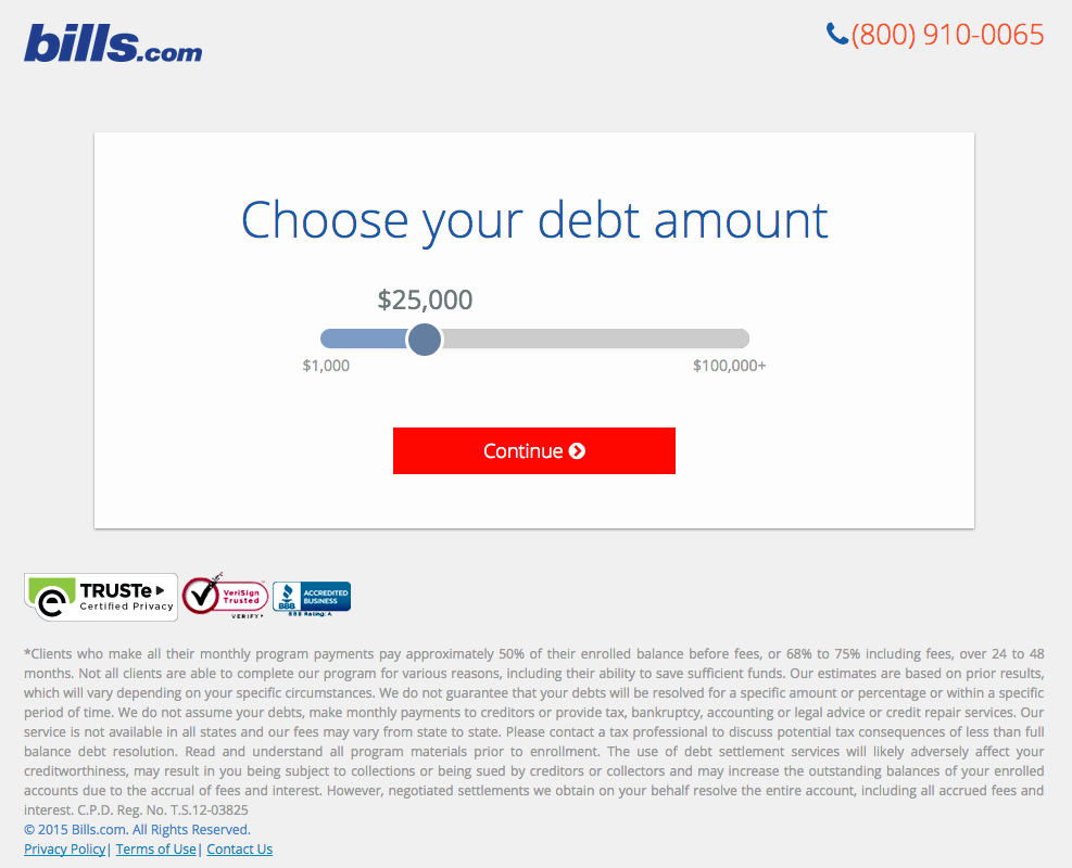
Often, people think landing pages are static pages on your website. But with the right tools, you can make them interactive and personalized.
Take the example above from Bills.com. To see if you’d benefit from their consultation, you answer three questions before you are shown a form.
Then, you answer two more questions, like the one below:

And here’s the final landing page form where you fill out your information:

I’m not sure how the algorithm works (or if there’s one at all), but while I was filling it out, I had some anxiety about not qualifying. Once I found out I did, I was excited to fill out the form, which I’m sure most people who are in debt and using this tool are. By making this offer seem more exclusive before the form appeared on the landing page, I’d bet that Bills.com increased conversions pretty significantly.
Why This Landing Page Works:
- Exclusivity: Everyone likes to feel special, which is why exclusivity works so well. The page gives the impression that the offer isn’t given to just anyone, you have to qualify first.
- Interactivity: Anytime you can get users to interact with the page, even if it’s something as simple as using a form with a sliding bar question.
What Could Be Improved:
- More Color: While the site is geared to not so fun topics like bills and debt, it doesn’t mean it has to be boring. The gray leaves much to be desired.
17. Zillow

Zillow did something very similar to Bills.com with their landing page. It starts with a simple form asking for “your home address” ( sounds creepy, but don’t worry. This form field is set on top of a hero image featuring a quaint home at dusk followed by a handy FAQ section.
Of course, the address itself won’t be enough to get a true appraisal value of a home. It just denotes the home’s neighborhood. It’s a bit like playing The Price is Right. You can guess how much homes in the area are worth and then type in an address to see how close you got. If you want to learn more info about a property, Zillow then prompts users to sign-up to continue.
 Once you hand over your email, you’ll have access to more data like comparable homes in the area, mortgage tools, and the estimated net profits should you decide to sell.
Why This Landing Page Works:
- Games are Fun: Anytime you can make filling out a form feel like a game, it’s a win.
- Establishes Authority on the Topic: Zillow has access to so much housing and neighborhood data, it’s no wonder they are one of the top home search sites in the nation.
What Could Be Improved:
- Nothing: The Zestimate page is simple, but effective. Those with concerns about what a Zestimate is and how it’s calculated have easy access to the homebuying FAQ on the second half of the page.
18. Landbot

Landbot, a service that creates chatbot-based landing pages, puts their own product front and center on their chat-fueled landing page. Visitors are greeted by a friendly bot —complete with emojis and GIFs —who encourages them to provide information in a conversational format instead of via a traditional form.
Why This Landing Page Works:
- It’s Fun: From the bright colors to the GIFs, this page keeps visitors engaged and entertained.
- Show, Not Tell: By having the chatbot right on the page, doing its thing, potential customers can see exactly what they’re getting. The whole experience simulates what it’s like to use Landbot’s product.
What Could Be Improved:
- Nothing: Landbot’s use of a live demo, testimonials, highlighted integration features and detailed breakdown of how the product works leaves new customers ready to sign up at first glance.
19. Webprofits

Like Industrial Strength Marketing mentioned earlier, Webprofits also makes great use of a predominantly black, white and red color scheme. The result is a clean layout that makes great use of the pops of color on the page. It’s a testament to the organization’s expertise in digital marketing and UX design.
The rollover description feature throughout the “What We Do” section, while black and white, uses movement to draw the reader’s attention to the content. Each section changes color and rolls down like a shade to reveal more in depth features.

They also make it easy for you to figure out what Webprofits actually does. The rest of the page offers detailed information about what you’ll get when you give over your information. Plus, it includes strategic CTAs throughout, like “Get in Touch”
Why This Landing Page Works:
- Informative, But Not Overwhelming: There’s a lot of information and text on this page, but the use of well-placed graphics and videos help break things up.
- Multiple CTAs: Placing the same CTA throughout the page makes it so visitors don’t have to scroll all the way to the top to “Get in Touch.”
What Could Be Improved:
- Nothing: Webprofit makes great use of the long landing page format, packing in all the pertinent information visitors would need in one place with a visually appealing experience.
20. Native Poppy
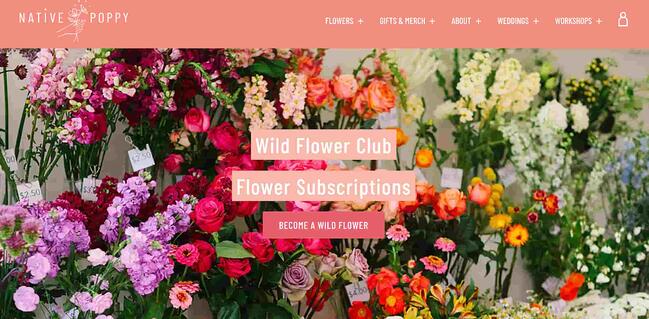
Sometimes, you’ve just got to stop and admire a landing page for being beautiful. Using high-resolution photography and lots of white space, Native Poppy’s landing page is a pleasure to look at.
Aside from its beauty, the page has some great elements: a clear and delightfully pink CTA, an informative “How It Works” section, plus an FAQ at the bottom. Best of all, it plays with language, ditching the phrase “become a subscriber” for “become a wild flower.” I don’t know about you, but I’d much rather be a “wild flower” over a subscriber any day.
Why This Landing Page Works:
- Captures Brand Voice: The layout of Wild Poppy mirrors the whimsical vibe of the brand. From the photos, font choice, and “wild flower” subscription, all the messaging works in harmony.
- Persuasive: By highlighting all the perks and discounts of being part of the subscription program, it entices customers to join.
What Could Be Improved:
- Form Visibility: While there are multiple CTAs, it would have been nice to have the form fields on the page for faster sign-up, or as a pop up after clicking, instead of having to click the CTA and then be taken to another series of prompts.
21. Conversion Lab

While I wouldn’t typically include an example of a homepage with a form on it in a post about landing pages, this website is special. The homepage is the entire website — the navigation links just take you to the information below.
When you click “Get My Free Consult,” the entire page darkens to highlight the form. See what it looks like before you click in the photo above.
And, when you click that CTA, check out how the form appears:
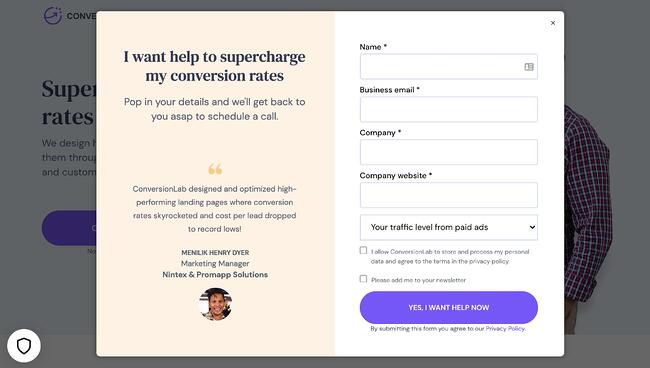
It’s a similar function when clicking on any of the headings on the page. Instead of taking you to a different page, it simply jumps to the corresponding section on the homepage.
I love how you don’t have to leave the page to fill out the form, or view any of the features, creating a seamless user experience.
Why This Landing Page Works:
- Creative: Having a homepage that also functions as various landing pages makes Conversion Lab unique. Best of all, it still provides a pleasant user experience.
- Organized Layout: Despite having the homepage and landing pages as one, the page doesn’t feel cluttered or busy at all.
What Could Be Improved:
- Form Placement: It would be nice if the form maybe opened up on one side so visitors could still read the content on the rest of the page.
Landing Page Ideas
A well-optimized landing page can transform prospects into leads by gathering information that can help you better understand, market to, and delight visitors. Since landing pages are crucial for conversions, it’s important to make sure they’re well planned, designed, and executed.
Here are a few things to keep in mind when creating landing pages:
- Appealing aesthetics: Giving your landing page color and a clean UI can only help. Visitors will want to learn more about your products and see evidence of the value you’re offering. Take a look at #18 on our list — Landbot for a great example of a stunning web page.
- Less is more: Let the offer or images do most of the talking, but be sure to include any and all descriptive headlines and supporting text to make your landing page clear and compelling. This goes for just about all the components on the page: try white space, simple copy, and shorter forms.
- Keep visitors on the page: By removing the main navigation or any distracting backlinks, it’s less likely there will be any lead generation friction that could cause visitors to abandon your page.
- Social Sharing: A simple way of getting visitors to engage with your landing page is including social media sharing buttons so that they can spread your content to their social followings. After all, customers are the center of your marketing flywheel.
- A/B testing: Landing pages are important to get right, and since consumer psychology can sometimes be surprising, it’s always better to experiment with different versions of your pages to see which has the highest conversion rate (CVR). Test the positioning of the offer, kinds of CTAs, or even the color scheme.
- Call-To-Action: The CTA is where the meat of the landing page is, or the tipping point where prospects become contacts. CTAs could ask visitors to subscribe, download, fill out a form, share on social media, and more — but, overall, CTAs are necessary for getting your audiences more engaged with your offering. To generate leads, CTAs should be bold and eye-catching, but most importantly, they need to effectively communicate value.
Creating Landing Pages That Shine
Landing pages aid in growing your customer base and increasing conversions. Create a page that delights customers with a user interface so great, they continue to come back for more.