

The latest redesign for Play Store comes to the settings menu.
What you need to know
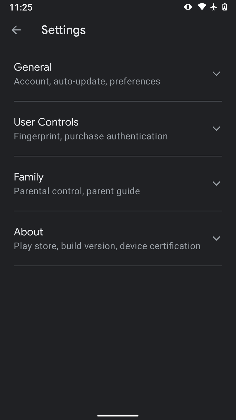
- New images show a redesign for the Play Store settings.
- The new settings menu features expandable sections instead of a full-page of listed options.
- This isn’t the only UI change for the Play Store being tested, with earlier leaks showing the removal of the hamburger menu.
Google has been on a redesign spree, with UI changed appearing across its apps, particularly Google Maps which has seen quite a few updates amid the pandemic. Of course, some of these updates are being tested, and not all of them have yet seen the light of day, but it’s always nice to see Google is trying to keep things fresh. The latest images of the Play Store, where you can find all the best Android apps, show UI changes coming to the settings menu that presents a much cleaner look for the app.
It looks like Google is doing away with the current look of the Play Store settings, as spotted by Android Police, which currently lists everything out on one page. Instead, the settings menu will consist of a set of four sections; General, User Controls, Family, About, then can be expanded to show their respective options. All-in-all, it’s a much cleaner look than the current iteration that should make options easier to find, even if it may take an extra step to do so.
The settings redesign isn’t the only UI change being tested for the Play Store. Back in October, images from an earlier test showed that Google was contemplating getting rid of the hamburger menu, and instead, placing the Play Store menu within the user thumbnail. A change like this would make some sense, particularly with Google’s move to a gesture-based navigation system, making hamburger menus somewhat difficult to access.
For now, only a small group of users are able to test out these changes. With the more recent settings redesign, it seems Google is still making tweaks to the app, meaning we may not see the new UI reach more devices for some time.