
Microsoft has a new look for Teams, including an improved dark theme and Fluent icons.
What you need to know
- Microsoft Teams has a refreshed look rolling out to public preview users.
- The refreshed look includes adjusted dark mode colors and drop shadows between panels.
- The new colors are in public preview now, but the other changes start shipping in mid-February.
Microsoft is rolling out an improved look for Microsoft Teams to public preview users. The improved design is built to feel “more modern and lightweight,” according to Microsoft. Teams users in public preview should soon see an improved dark theme, drop shadows between panels, and icons with Microsoft’s Fluent Design language.
The color and styling changes, including a darker dark theme, are already rolling out to public preview users. The other changes, including the new icons within the app, should start shipping in mid-February.
Here are the specific changes, as outlined by Microsoft:
- Color adjustments to the default and dark themes
- Added drop shadows between panels
- Icons updated with Fluent icon set, emphasizing rounded corners
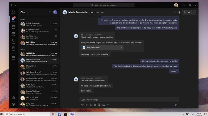
One of the more noticeable changes is that the dark theme of Microsoft Teams appears to be significantly darker than the previous dark theme.
The changes are enabled by default if you are in the public preview for Microsoft Teams. To check out the changes, you can join the Microsoft Teams public preview program.
What do you think of the new changes? Do you think they’re improvements over its old design? Let us know in the comments below.
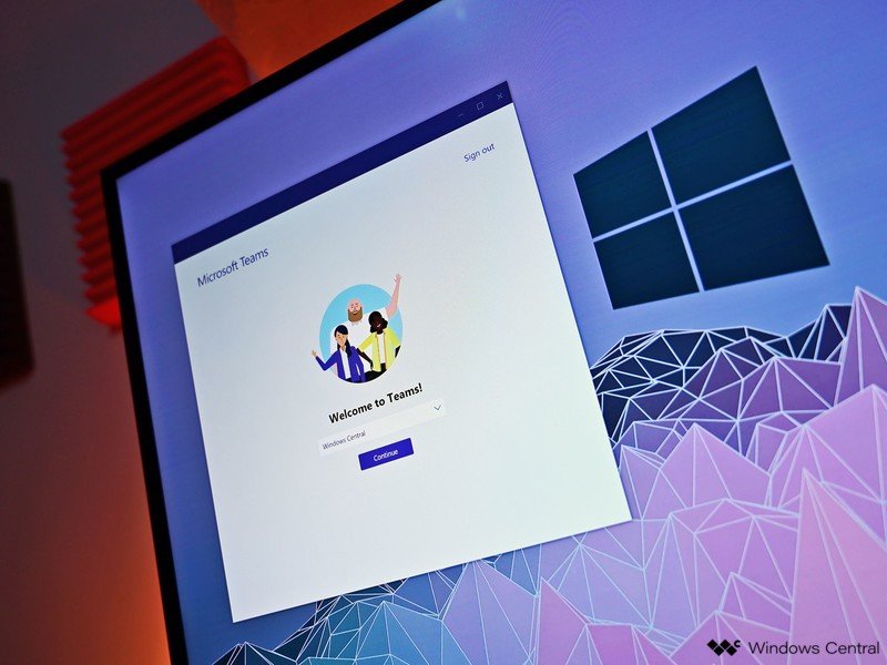
Microsoft Teams
![]()
Microsoft Teams allows you to collaborate with colleagues, upload files, send messages, and chat through video. It integrates with Office 365 and several other cloud services.