I’m frequently asked by Google Ads advertisers how their campaigns compare with competitors.
It’s an imprecise question. It could refer to performance, exposure, messaging, or more. The most relevant answer is typically impression share — the number of impressions your ads receive divided by the total available. For example, if your ads received 50 impressions and 100 impressions were possible, the impression share would be 50 percent.
Google is somewhat transparent about how it calculates impression share. Google’s help page lists as factors targeting settings, approval statuses, and quality, among other variables. Impression share is a helpful metric, but it’s best to view it broadly over time. For example, if your impression share is 31 percent one week, 45 percent the next week, and 52 percent the week after, you know that your optimization efforts are succeeding.
To view how your impression share stacks up against competitors, navigate to “Auction insights” in the left-side navigation in the Google Ads dashboard. You can view metrics at the campaign, ad group, keyword, and product group levels. Choose a date range and see the info. (For impression trends, see “View Over Time,” below.)
The example below shows my impression share at 39.33 percent. Nespresso.com’s is nearly twice as much at 74.59 percent. Amazon (28.72 percent) and Target (10.18 percent) are lower. Advertisers cannot select competitors; Google chooses automatically.

In this example, the author’s impression share is 39.33 percent. Nespresso.com’s is 74.59 percent. Amazon (28.72 percent) and Target (10.18 percent) are lower.
The Auction insights report includes multiple competitor metrics. They are:
- Overlap rate. How often a competitor’s ad and your ad received an impression in the same auction. For example, competitor A overlapped with your ads 10 percent of the time.
- Position-above rate. How often a competitor’s ad appears above yours in the same auction. A position-above rate of 30 percent means the competitor’s ad showed above yours three out of 10 searches.
- Top of page rate. How often ads from you or a competitor show at the top of the page.
- Absolute top-of-page rate. How often ads from you or a competitor show as the first placement above the organic results.
- Outranking share. How often your ad appears above a competitor’s. An outranking share of 60 percent means that your ad showed higher than a particular competitor six out of 10 searches.
View Over Time
Google offers many options to view impression share data. In the top navigation of the Google Ads interface, click Reports > Predefined reports (Dimensions) > Auction insights.
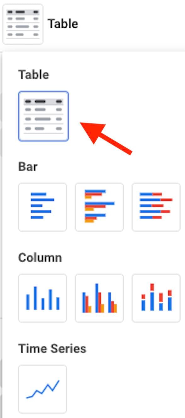
Then select Search and/or Shopping. Filter for your asset (for example, campaign A or ad groups with “ABC” in the name). Then click the “Table” option and select “Time Series” to view the data over time — daily, weekly, monthly, quarterly, or yearly.
Click the “Table” option and select “Time Series” to view the data over time — daily, weekly, monthly, quarterly, or yearly.
—
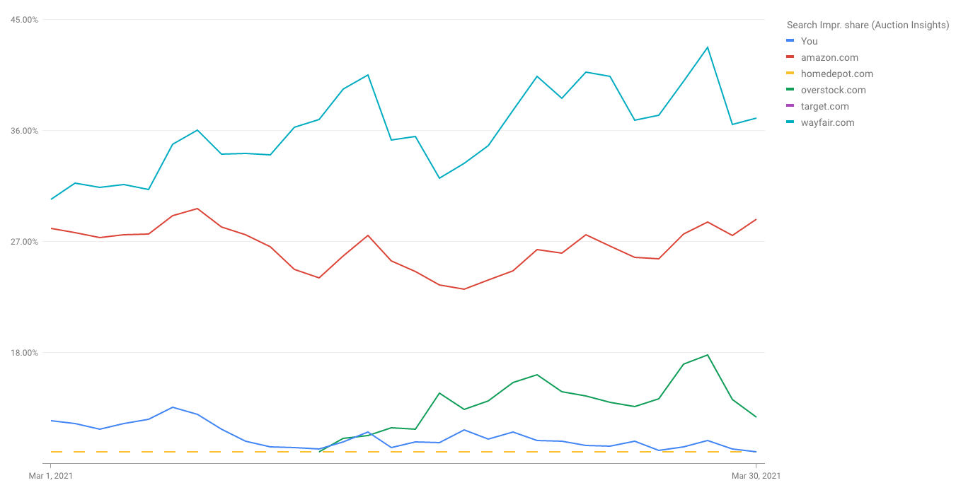
The example below shows my account’s impression share against competitors throughout March 2021. The graph tells us that my impression share (blue line at the bottom of the graph) was relatively low compared to competitors — Amazon.com, Homedepot.com, Overstock.com, Target, com, and Wayfair.com.
The author’s March 2021 impression share (blue line at the bottom of the graph) was relatively low compared to competitors — Amazon.com, Homedepot.com, Overstock.com, Target, com, and Wayfair.com. Click image to enlarge.
Other trends from the graph include:
- Overstock increased impression share in the second half of March, potentially due to additional budget.
- My impression share declined during the month. A possible reason is that we were running a promotion in the first two weeks for which we wanted more exposure.
- Amazon started and ended the month with roughly the same impression share while it dipped in the middle.
The trends provide context to my account. For example, Amazon, Overstock, and Wayfair increased impression share in the second half of the month while mine decreased. Perhaps these advertisers increased budgets or updated bid strategies or both.
Advertisers can schedule these reports and include other metrics, such as a daily view of the top-of-page rate versus competitors. In short, Auction insights help in understanding the performance of your Google Ads.


