

No matter what you use Excel for, whether business financials or a personal budget, the tool’s data analysis features can help you make sense of your data. Here are several Excel features for data analysis and how they can help.
Quick Analysis for Helpful Tools
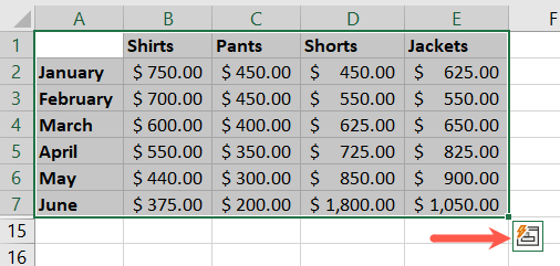
When you aren’t quite sure of the best way to display your data or if you’re a new Excel user, the Quick Analysis feature is essential. With it, you simply select your data and view various analysis tools provided by Excel.
Select the data you want to analyze. You’ll see a small button appear in the bottom corner of the selected cells. Click this Quick Analysis button, and you’ll see several options to review.
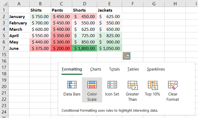
Choose “Formatting” to look through ways to use conditional formatting. You can also select “Charts” to see the graphs Excel recommends for the data, “Totals” for calculations using functions and formulas, “Tables” to create a table or pivot table, and “Sparklines” to insert tiny charts for your data.
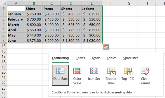
After you pick a tool, hover your cursor over the options to see previews. For example, if you select Formatting, hover your cursor over Data Bars, Color Scale, Icon Set, or another option to see how your data would look.
Simply choose the tool you want and you’re in business.
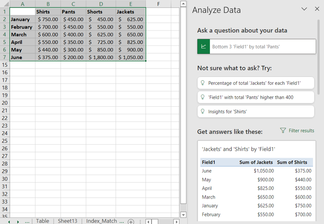
Analyze Data for Asking Questions
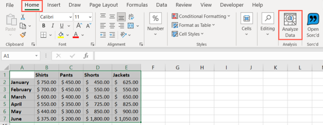
Another helpful built-in feature in Excel is the Analyze Data tool. With it, you can ask questions about your data and see suggested questions and answers. You can also quickly insert items like charts and tables.
Select your data, go to the Home tab, and click “Analyze Data” in the Analysis section of the ribbon.
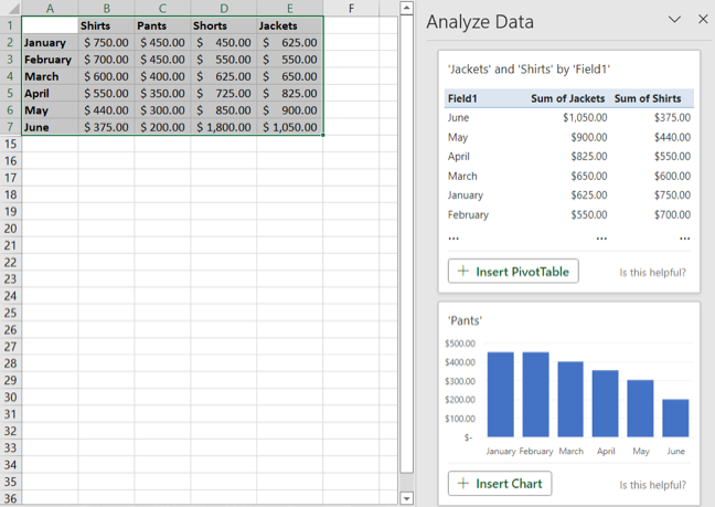
You’ll see a sidebar open on the right. At the top, pop a question into the search box. Alternatively, you can choose a question in the Not Sure What to Ask section or scroll through the sidebar for recommendations.
If you see a table or chart in the list you want to use, select “Insert Chart” or “Insert PivotTable” to add it to your sheet with a click.
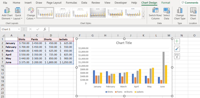
Charts and Graphs for Visual Analysis
As mentioned above, charts make great visual analysis tools. Luckily, Excel offers many types of graphs and charts, each with robust customization options.
Select your data and go to the Insert tab. You can choose “Recommended Charts” in the Charts section of the ribbon to see which graph Excel believes fits your data best.
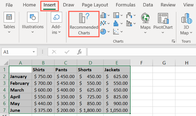
You can also pick “All Charts” in the Recommended Charts window or choose a specific chart type in that same section of the ribbon if you know which kind of visual you want.
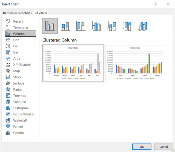
When you pick a chart type, you’ll see it appear in your sheet with your data already inserted. From there, you can select the graph and use the Chart Design tab, Format Chart Area sidebar, and chart buttons (Windows only) to customize the chart and the data in it.
For more, check out our how-tos for making graphs in Excel. We can help you create a pie chart, waterfall chart, funnel chart, combo chart, and more.
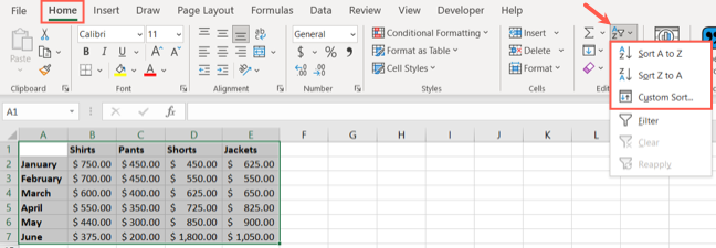
Sort and Filter for Easier Viewing
When you want to analyze particular data in your Excel sheet, the sort and filter options help you accomplish this.
You may have columns of data that you want to sort alphabetically, numerically, by color, or using a particular value.
Select the data, go to the Home tab, and open the Sort & Filter drop-down menu. You can choose a quick sort option or “Custom Sort” to pick a certain value.
Along with sorting the data, you can use filters to see only the data you need at the time. Select the data, open the same Sort & Filter menu, and pick “Filter.”
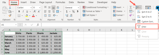
You’ll see filter buttons at the top of each column. Select a button to filter that column by color or number. You can also use the checkboxes at the bottom of the pop-up window.
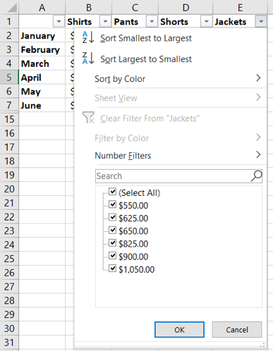
To clear a filter when you finish, select the filter button and choose “Clear Filter.” To turn off filtering altogether, return to the Sort & Filter menu on the Home tab and deselect “Filter.”
Functions for Creating Formulas
Excel’s functions are fantastic tools for creating formulas to manipulate, change, convert, combine, split, and perform many more actions with your data. When it comes to analyzing data, here are just a handful of functions that can come in handy.
IF and IFS
The IF and IFS functions are invaluable in Excel. You can perform a test and return a true or false result based on criteria. IFS lets you use multiple conditions. IF and IFS are also useful when you combine them with other functions.
COUNTIF and COUNTIFS
The COUNTIF and COUNTIFS functions count the number of cells containing data that meets certain criteria. COUNTIFS lets you use multiple conditions.
SUMIF and SUMIFS
The SUMIF and SUMIFS math functions add values in cells based on criteria. SUMIFS lets you use multiple conditions.
XLOOKUP, VLOOKUP, and HLOOKUP
The XLOOKUP, VLOOKUP, and HLOOKUP functions help you locate specific data in your sheet. Use XLOOKUP to find data in any direction, VLOOKUP to find data vertically, or HLOOKUP to find data horizontally. XLOOKUP is the most versatile of the three and is an extremely helpful function.
UNIQUE
With the UNIQUE lookup function, you can obtain a list of only the unique values from your data set.
Conditional Formatting for Spotting Data Fast
Conditional formatting is a favorite feature for sure. Once you set it up, you can spot specific data quickly, making data analysis go faster.
Select your data, go to the Home tab, and click the Conditional Formatting drop-down menu. You’ll see several ways to format your data, such as highlighting cells greater or less than a specific value or showing the top or bottom 10 items.
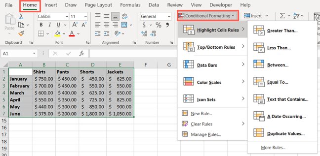
You can also use conditional formatting to find duplicate data, insert color scales for things like heat maps, create data bars for color indicators, and use icon sets for handy visuals like shapes and arrows.
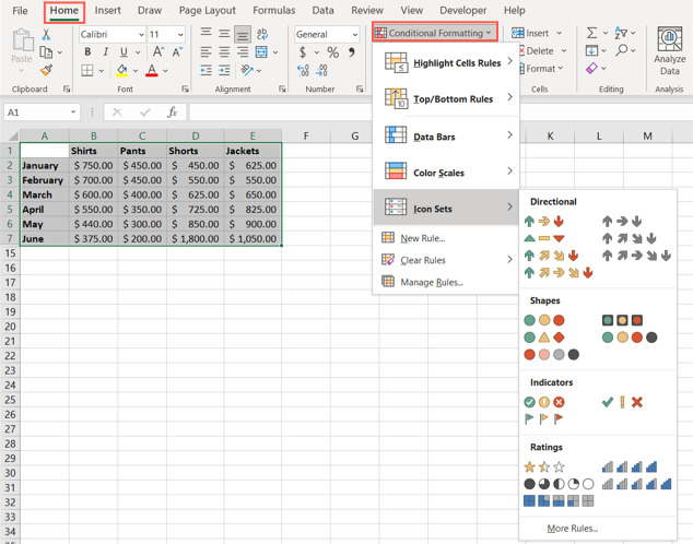
Additionally, you can create a custom rule, apply more than one rule at a time, and clear rules you no longer want.
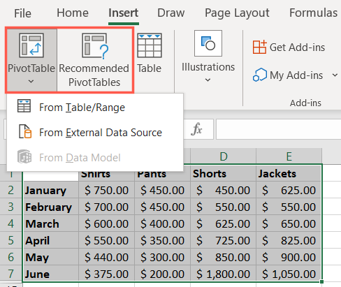
Pivot Tables for Complex Data
One of the most powerful Excel tools for data analysis is the pivot table. With it, you can arrange, group, summarize, and calculate data using an interactive table.
Select the data you want to add to a pivot table and head to the Insert tab. Similar to charts, you can review Excel’s suggestions by selecting “Recommended PivotTables” in the Tables section of the ribbon. Alternatively, you can create one from scratch by clicking the PivotTable button in that same section.
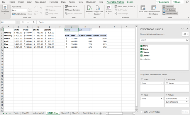
You’ll then see a placeholder added to your workbook for the pivot table. On the right, use the PivotTable Fields sidebar to customize the contents of the table.
Use the checkboxes to choose which data to include and then the areas below to apply filters and designate the rows and columns. You can also use the PivotTable Analyze tab.
Because pivot tables can be a little intimidating when you get started, check out our complete tutorial for creating a pivot table in Excel.
Hopefully, one or more of these Excel data analysis features will help you with your next review or evaluation task.