
Charts are important for presenting data in a format that is easy to understand, especially for people such as students and professionals that work with data. The most popular program for creating charts is Excel, but did you know that you can create charts in Google Docs? Google Docs is an online web base processor that lets you create and format documents and is included as a part of the Google Docs Editor suite. Let us see how to create charts in Google Docs.

How to create a Chart in Google Docs
Follow the steps below to create a chart in Google Docs:
- Click the Insert tab, hover the cursor over Chart, and select a chart.
- Click the three dots beside the Linked Chart button and select Open Source.
- Change the data on the axis of the chart and customize the chart.
- Go back to Google Docs and click the Update button on the chart.
- The chart is updated.
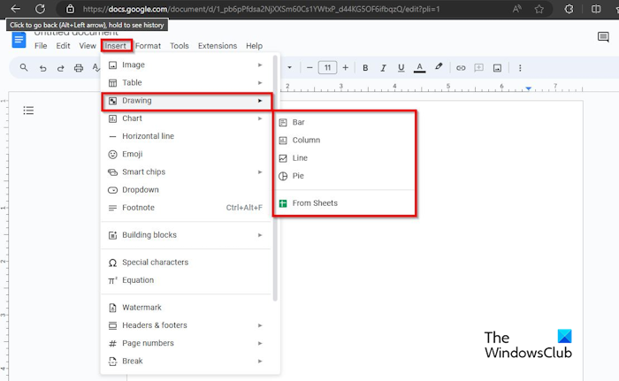
Click the Insert tab, hover the cursor over Chart, and select a chart from the menu.
Google Docs inserts the chart into the document. In this tutorial, we have selected the pie chart.
Where you see the Linked Chart button located on the chart, click the three dot button and select Open Source from the menu.
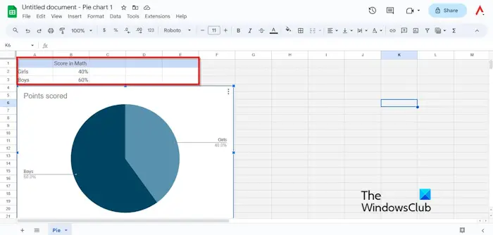
A Google Sheets window will open.
You can change the data on the axis of the chart.
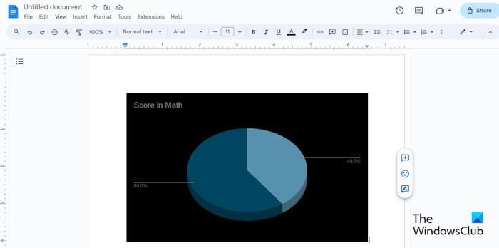
To change the chart colors of the slices of the pie chart.
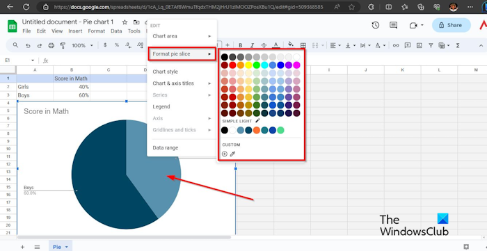
Right-click one of the slices of the pie chart, hover the cursor over Format Pie Slice, then select a color. The slice will change to the color that you have selected. Do the same method to change the color of the other slice.
If you want to change the border and background color of the chart.
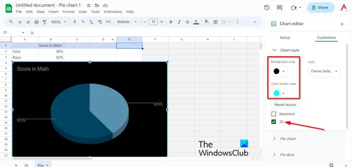
Right-click the chart and select Chart Style. You can change the chart’s border and background color.
You can check the 3D check box to give the pie chart a 3D look.
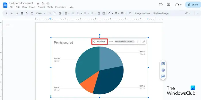
Then go back to Google Docs and click the Update button on the chart.
Your chart is updated.
What are different types of charts in Google Docs?
In Google Docs there are four types of charts, namely Pie, Bar, Line, and Column. Each chart has a purpose. The Bar chart is used to show the difference between one or more categories. The Pie chart shows data as slices or proportions of a whole. The Line chart is used to show trends or data over time. The Column chart shows one category or more of data, especially if the data has subcategories.
READ: How to flip an Image in Google Docs
How do you make a bar graph on Google Docs?
To make a bar graph in Google Docs, follow the steps below:
- On the Insert tab, hover the cursor over Chart and select Bar from the menu.
- If you want to switch the row and columns. On the Linked Chart button, click the three dot button and select Open Source from the menu.
- A Google Sheets window will open.
- Click the chart and click the three dots and select Edit Chart from the menu.
- On the Setup tab, check the check box for switch rows or columns.
- Go back to Google Docs and click the Update button on the chart.