
It’s easy to see why people have pegged the Oppo Watch as an Apple Watch clone. Squint your eyes and it looks like an Apple Watch. Say the name fast enough and it sounds like Apple Watch. Elements of the UI and packaging were clearly inspired by the Apple Watch.
That said, “clone” is a loaded word, intended to immediately bias people against something as inappropriately derivative. Once I actually held the Oppo Watch in my hand and put it on my wrist, it felt less derivative of the Apple Watch than a potential evolution of it. Apple could release a Series 6 Watch with an identical industrial design, and no one — except a handful of “Apple would never do that!” pundits — would be surprised. That’s no easy feat for any hardware maker, let alone Oppo, a much smaller rival to the world’s largest company.
Blame Oppo if you want, but Qualcomm and Google are the companies that quietly made Oppo Watch (and a huge collection of less impressive wearables) possible. Qualcomm’s Snapdragon Wear 3100 is the chip inside, and Wear OS by Google powers most of the software. Oppo’s industrial design is clearly inspired by Apple’s, but it actually goes further in a number of particulars — not just in how it looks, but in how it works. That’s good news for the Android platform, which is still hunting for a champion watch, and for wearables generally, as there’s an upward trend in combined quality, performance, and functionality at the consumer-friendly $300 price point.
The first thing that stands out about my 46mm Oppo Watch review unit is its atypically large screen: It has a 1.91-inch AMOLED display, visibly bigger than the latest 44mm Apple Watch’s 1.78-inch screen, and with a higher resolution — 476×402 pixels versus 448×368. Those differences may sound trivial, but when you see them in person, you realize Oppo’s extra pixels mean more space for text and graphics. Step by step, watches are about to become more like smartphones, and Oppo Watch feels a little closer in that regard than the Apple Watch Series 5.
Above: The Oppo Watch is leading the way toward more smartphone-like wearables.
Image Credit: Jeremy Horwitz/VentureBeat
Despite using the same operating system as Fossil’s circular Gen 5 watches, Oppo Watch has a rectangular screen that makes menus feel less cramped, and here that difference feels somewhat meaningful. Features that should work the same between the two Snapdragon Wear 3100 devices feel more complete on Oppo’s design because you can see more of them. A screen with text is readable without scrolling, there’s more space for icons, and so on.
This isn’t a full endorsement of either the concept of a rectangular watch screen shape or of growing watch screen sizes until they become ridiculously big. But if the Apple Watch seemed in danger of getting stuck at its current dimensions, the Oppo Watch shows there’s still room and reason for the screen to grow.
My favorite part of the larger Oppo screen: Graphics look bolder. I strongly believe that smartwatches need to be timepieces, first and foremost, and I hate that so many watches make telling the time a chore. Oppo pairs its display with some watch faces that are simultaneously stylish and readable from a distance, like Sports, as well as a beautifully animated flower face called Blossom. Neither looks exactly like something Apple has done, but both continue where Apple left off with early Motion and Nike+ faces.
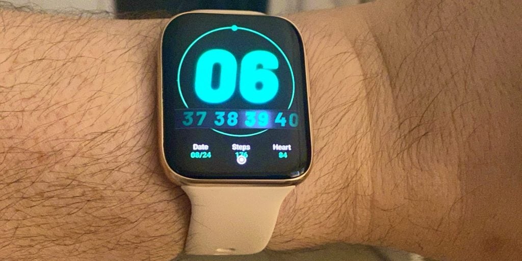
Above: The “Sports” face.
Image Credit: Jeremy Horwitz
While a handful of elements could have been implemented by Apple in an alternate universe, most of the UI feels like the latest version of Wear OS, for good and bad. Swipe up, down, left, or right from the watch face and you’ll pull up one of four panes. Notifications for a relevant pane (say, right) are intuitively indicated by a bar of color on the edge that needs swiping. Press the top of two right-side buttons and you’ll open a scrolling nine-icon app grid; hold it and you bring up Google Assistant. Press the lower button to call up a list of one-tap workouts or hold it to bring up power off, restart, and power saver buttons that look a lot like Apple’s.
The core apps are largely familiar from prior Wear OS releases, and come with the standard caveat: They’re not polished to Apple levels of performance. But Oppo’s sleep app is nice — nicer than Apple’s Sleep app in beta versions of watchOS 7. It’s similarly limited, promising only to track total number of hours of sleep with light and deep sleep distinctions, and it doesn’t track naps: For now, it only works from 8 p.m. to 10 a.m. the next day. But it properly pegged the number of hours I slept, and its light/deep characterizations tracked with my own recollections. Sleep data is synced to Google Fit, which is a few steps behind Apple’s Health app, but not bad.
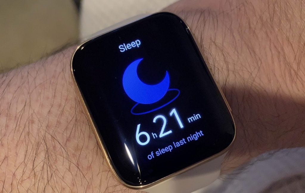
Above: Oppo’s sleep tracker.
Image Credit: Jeremy Horwitz
Something I initially couldn’t get to work quite right: an “AI outfit” watch face that’s supposed to use your phone to take a photo of your clothing, then generate watch face colors and patterns to match what you’re wearing. It’s a cute idea, if gimmicky, but the photo synchronization didn’t work when I tested it with the Wear OS app: Five pre-generated AI faces looked ugly, akin to the covers of 1980’s junior high school binders. It turns out you need another Android app, HeyTap Health, to generate new but equally ugly alternatives based on photos.
I mentioned “Apple would never do that!” pundits above because they might flip out about how Oppo achieved its screen size gain. Rather than forming a perfect little dome atop the watch, Oppo’s front display glass extends past its left and right edges in a waterfall style, though the flexible OLED screen inside doesn’t curve so deeply around the sides as to impact usability or visibility. The side glass edges extend deeper than Apple’s into the polished aluminum central frame, potentially inviting easier damage from impacts. We’ll have to see how it holds up over time.
Oppo’s rear housing mirrors the front, causing the central metal frame to taper in a way Apple die-hards might pooh-pooh until Apple itself follows suit. I personally find the design to be attractive, and even though there are small issues of symmetry and elegance that could be tweaked, the Apple Watch has some of those, too.
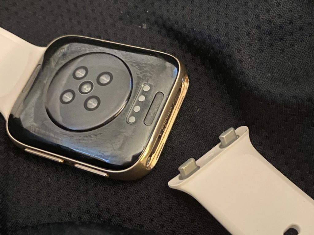
One huge surprise is that Oppo’s user-replaceable bands use Apple-style simple thumbnail release buttons yet simultaneously manage to attach and detach more efficiently from the metal frame. Each band is held in place by two locking pins that are released when you depress the inner button. Since there are no huge lugs in the top and bottom of the frame, this actually strikes me as a better use of critical internal watch space than Apple’s design, enabling Oppo to fit a 416mAh battery inside — much bigger than Apple’s 296mAh Series 5 cell, with up to 36 hours of promised run time and a 21-day timepiece/step tracking only mode. I wouldn’t be shocked if Apple was “inspired” by this design in the future.
I’m not going to tell you the Oppo Watch is perfect or a superior Android alternative to the Apple Watch — or that it has definitively solved some of the problems that continue to gnaw at Apple fans five years after the first Watch debuted. For instance, Apple’s selection of Watch faces isn’t very large, and Oppo’s is even smaller. Apple’s icon grid and Home screen are miserably tiny, and Oppo’s aren’t great, either. Best of luck getting all the robust third-party apps you might want on either platform; they’re both compromises.
Moreover, Oppo leaves a bunch of boxes unchecked by comparison with Apple’s latest Watch. For instance, Oppo Watch has multiple rear heartbeat sensors but no EKG functionality. The screen is quite bright and supports 100% of the DCI-P3 color gamut, but it doesn’t have an always-on mode. You get a magnetic charging cradle — with pins — that’s not quite as elegant as Apple’s inductive charging puck. And when I went hunting for replacement watch bands to swap out for the included silicone strap, I largely found “coming soon” rather than “delivering tomorrow” signs online. If you’re living in China, where Oppo Watch was available (with some differences) ahead of the recent overseas launch, you might have better options.
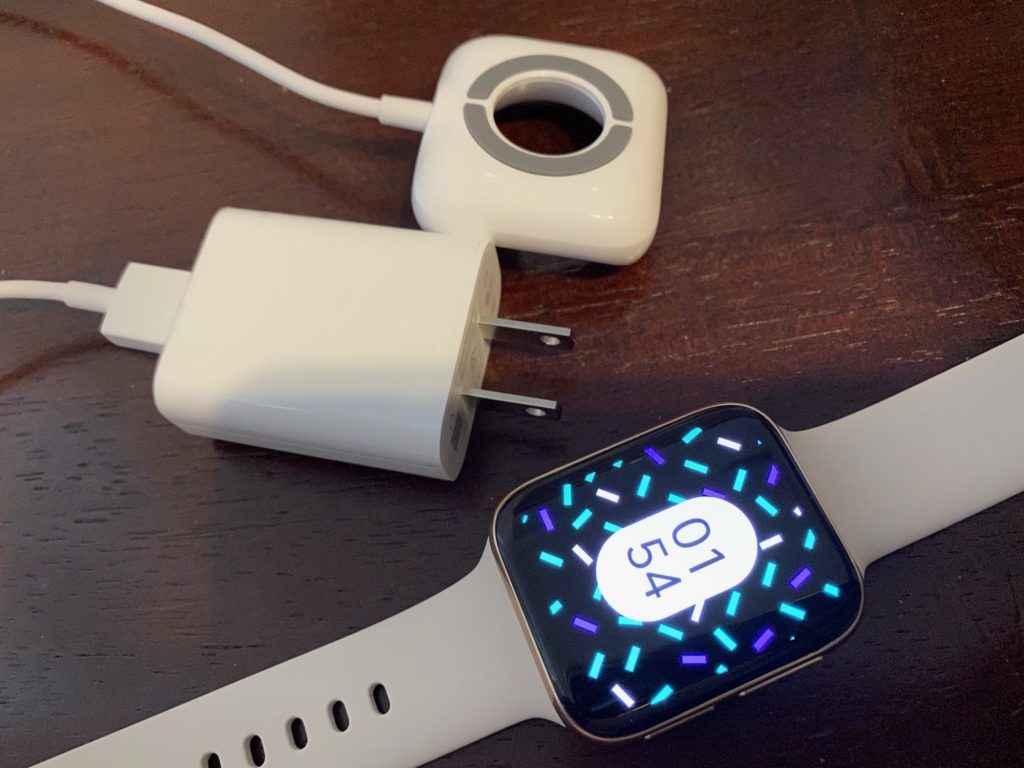
Above: Oppo’s charging dock and the Oppo Watch with its “AI Outfit” watch face. The wall charger shown here isn’t included.
Image Credit: Jeremy Horwitz/VentureBeat
But the overall package Oppo Watch offers is compelling. At press time, the 46mm version retails for around $350 but can be had for between $299 and $399, depending on your color and metal preference, while a smaller 41mm version with the typical compromises — screen size, battery capacity, and resolution — sells for $299 or less. Those prices occupy the sweet spot between the $199 Apple Watch Series 3 and $399 Apple Watch Series 5, following Fossil’s $295 Gen 5 strategy of offering better materials and/or components where possible, while not exceeding Apple’s options in overall performance.
As an iPhone user, I wouldn’t pick the Oppo Watch over my current Apple Watch. But I’m going to envy that bigger screen, bigger battery, and Oppo’s watch face options until Apple catches up with them. The race to perfect a wearable just became a little more crowded, and whether you consider its design derivative or evolutionary, it’s nice to see Oppo in the running.